For decades, businesses have used shop-front signages to advertise and market their business to the local audiences and passersby. According to marketing research, about 85% of your customers live, work or walk by your store every day. Therefore shop-front signage is important because it reinforces your brand and serves as a reminder that your shop exists and is available to serve its customers.
While you may be tempted to play around with colors and fonts, there are many things to consider when designing your shop.
Table of Contents
The size of the signage
Your shop-front signage will be bigger than your business card or the brochures you pass around for prospective customers to see. Think about your design elements since you will be scaling up the size. For instance, will the logo still look better after scaling up, or will it look weird?
Many business owners are tempted to add more information in their signages, but that may not be a good idea. The simpler your signage is, the better. Keep the font and layout concise for maximum impact.
Material
The material is also a big consideration when designing your shop-front signage. The material the signage is printed on significantly impacts the final look. For instance, a traditional banner will look very different from digitally printed signage. Thankfully, there are various styles of signages to choose from, from posters to the latest LED signboards. The material affects your design choices, including the font, colors, and file format.
Location of the sign
You should also consider the location you intend to place the signage. For instance, if the site has many trees, signage with a green background will not be the best idea because it will not stand out. If your shop is located around buildings, signages with dark colors will blend in, making it hard to see or stand out. Ensure you use a contrasting color to make your signage stand out from afar.
Your brand
The purpose of your shop front signage is to advertise your brand and reinforce it, so you have to keep your overall brand in mind when designing it. For instance, business signs for the perfume shop stand out because they are brand-focused, simple, illuminated, and eye-catching. Creating signage is more than just putting your logo on the signage. Take your time to think about the font and colors on your marketing materials to keep them consistent.
Illumination
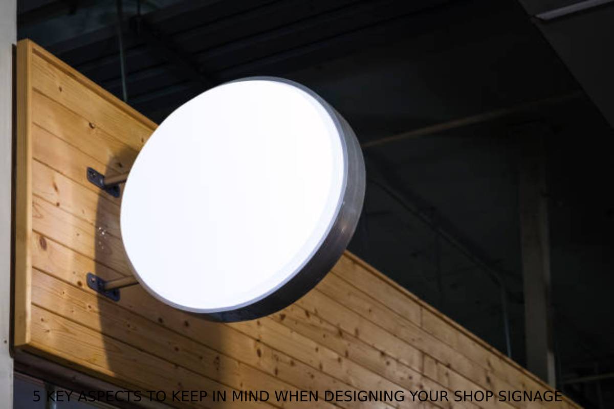
Have you ever strolled around a city at night and seen how illuminated brand signages stand out? Today, illuminated signages are the real deal. Even if you don’t operate your business at night, the signages can help your brand stand out and be identifiable in the evening and night hours. That way, you can benefit from more visibility 24/7.
The bottom line
Many aspects go into designing the perfect signages for your shop. Most importantly, the signage should be eye-catching simple and must reflect your brand to promote your business maximumly.


